
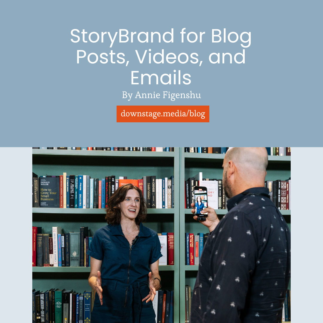
Create a Visual Identity That Tells the Right Story
If your visual identity doesn’t match your message, people feel the disconnect before they understand why. In this conversation with designer Lee Seidenberg, we break down how to create a visual identity for thought leaders that reinforces authority instead of diluting it. Read on.
You can have a strong message and still lose people visually. It happens when:
Your website looks like a template.
Your LinkedIn banner says one thing while your content says another.
The colors you use are always just a smidge different.
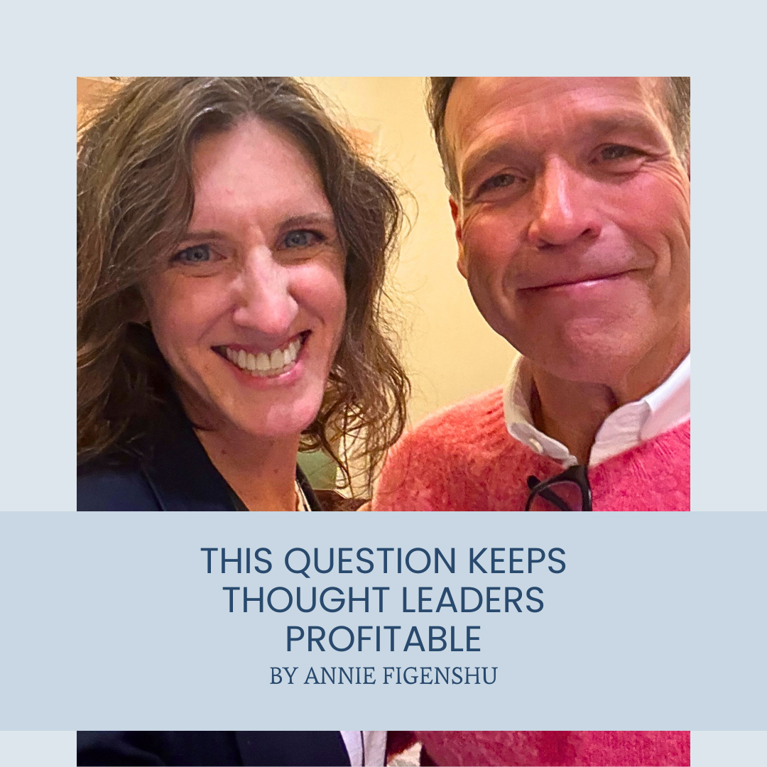
I recently had a conversation about this with Lee Seidenberg, an award-winning Creative Director and founder of the holistic marketing company, VC-5. Lee spent more than two decades in New York’s top agencies, working on brands like Apple, Google, and Microsoft. Now he helps small businesses show up with intention.
In our conversation, we focused on perception.
How quickly people form impressions.
How visuals communicate before words do.
How small inconsistencies shape trust.
Research from the International Journal of Human-Computer Studies shows that users form aesthetic judgments about a website in as little as 17 to 50 milliseconds.
That’s really freaking fast.
Visual complexity and how “right” a design looks for its category are processed almost instantly. And those first impressions influence whether someone keeps reading or moves on.
Twenty Swedish Masseuses
When I was touring in an improv show, the musician before us mentioned how his tour rider included “20 Swedish masseuses.” Not because he expected them to appear. He wanted to know if the venue had actually read the contract.
If they crossed it out or questioned it, he knew they were paying attention to what he really needed onstage: the right microphone, the right stool. If they didn’t notice it, that meant they likely missed the important details too.
Small details reveal how closely someone is operating.
Your visual identity functions the same way.
Visual identity works at the intersection of clarity and consistency. Small inconsistencies across touchpoints signal bigger questions about your brand.
As Lee said in our conversation, “I see all the visual touch points as messaging also... what messaging are you sending with your visuals and your aesthetics?”
Lee explained that when customers see inconsistency or "cheap" visuals, it creates a "subconscious... feeling" that the company "might cut corners" or doesn't pay attention to details. That reaction determines whether they pay attention or move on.
Why Visual Identity for Thought Leaders Is a Strategic Move
When I talk with speakers and founders about visual identity, the conversation usually is about logos and colors. Like it’s a surface issue.
In our conversation, Lee didn’t talk about aesthetics first. He talked about touchpoints.
“Any touch point that you have is your marketing. So how you show up in all those touch points is your marketing.”
It’s all signaling something. And based on those signals, someone is going to decide whether or not they work with you.
Lee mentioned the “subconscious feeling” people get when something doesn’t line up. They may not be able to explain it, but they form opinions about your brand based on all of the places that they see you.
So it’s important to show up consistently in those places.
As Jim MacLeod, author of The Visual Marketer says, “Visual marketing stands at the intersection of content marketing and brand marketing.”
Creating a Visual Identity That Aligns With Your Positioning
So, we know that it’s important to have a consistent visual identity that lines up with your positioning and your offers. The question is: how can you create a consistent visual identity for your brand?
Here are some steps to take based on my conversation with Lee.
Review Your Current Visual Identity and Schedule the Update
Audit Every Place Your Visual Identity Appears
Create On-Brand Visuals for the Channels You’re Keeping
Let’s get into each one.
1.Review Your Current Visual Identity
Take a look at your current visual identity. Does it need an update?
If you look across your website, slides, LinkedIn, and headshots and they feel like different versions of you, that’s a sign. It could also be time for a visual update when your touchpoints don’t align, when your positioning has evolved, or when your visuals create even a slight hesitation. Your visuals should reflect where you are now, not where you started.
If it is time for an update, put a date on the calendar for when you and your team can actually take care of it. This could be a week from now, or it could be next quarter. Whenever it makes sense, make sure it happens.
Remember, it will take more time than you think: hiring someone, deciding on the look, etc. But knowing that you’re budgeting the time makes the task seem more manageable — especially for a small team.
Once you’ve got your brand identity in shape, put it in a brand style guide that anyone who touches content creation can access.
2. Audit Where Your Brand Shows Up.
Think about where your brand shows up.
“If a channel no longer reflects your positioning, hide it. Archive it. Delete it.
Then decide where you do want to show up.
And make those places intentional.”
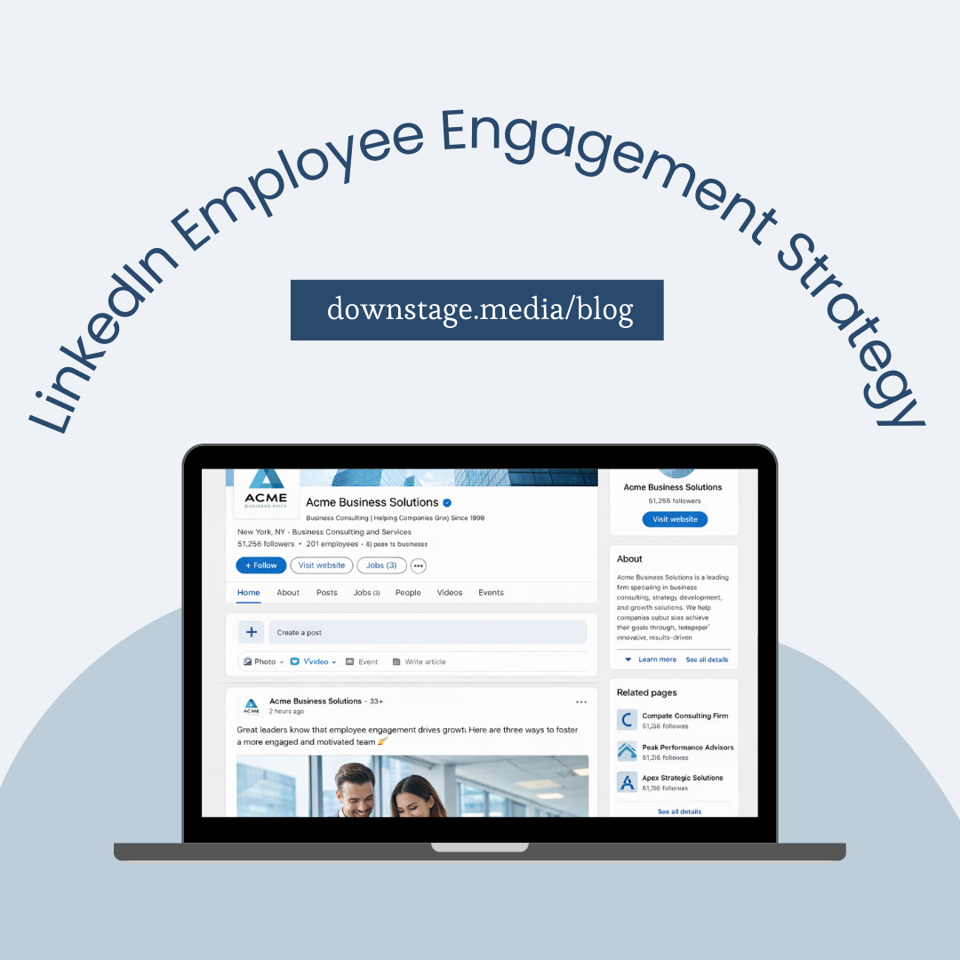
LinkedIn company pages.
Your website.
Profile pictures.
Slide decks.
Email headers.
It’s probably more places than you realize.
Go through your email automations, too. Where are those links taking people? What version of you are they landing on?
If every touchpoint is marketing, then every outdated page is also marketing.
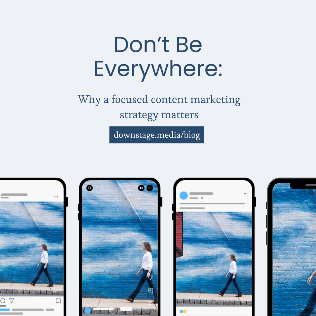
You don’t have to be everywhere.
If a channel no longer reflects your positioning, hide it. Archive it. Delete it.
Then decide where you do want to show up.
And make those places intentional.
3. Create On-Brand Visuals for the Channels You’re Keeping
Once you’ve clarified your visual identity and decided where you’re showing up, it’s time to implement.
This is where your brand style guide matters.
As Jim MacLeod writes in The Visual Marketer, “The brand style guide is your shield against bad ideas.”
I’d add: it’s also your shield against hasty ones.
Most teams aren’t trying to make bad decisions. They’re just moving quickly.
“We don’t have time.”
“This looks good enough.”
“Let’s just use this color so it pops.”
That’s how brand visuals start to get off course.
A style guide exists for the moments when you don’t have time. When you’re under pressure. When you need to move fast.
The decisions are already made: fonts are chosen, colors are defined, layout rules are clear.
And this is another reason not to be everywhere.
The more channels you maintain, the more opportunities you create for inconsistency.
Choose where you’re showing up.
Then show up there well.
Build From the Inside Out
In our conversation, Lee talked about how easy it is to start with a website template and then try to fit your message into it. That’s when things get crowded. Too many ideas. Too many calls to action. A design that looks complete but doesn’t feel focused.
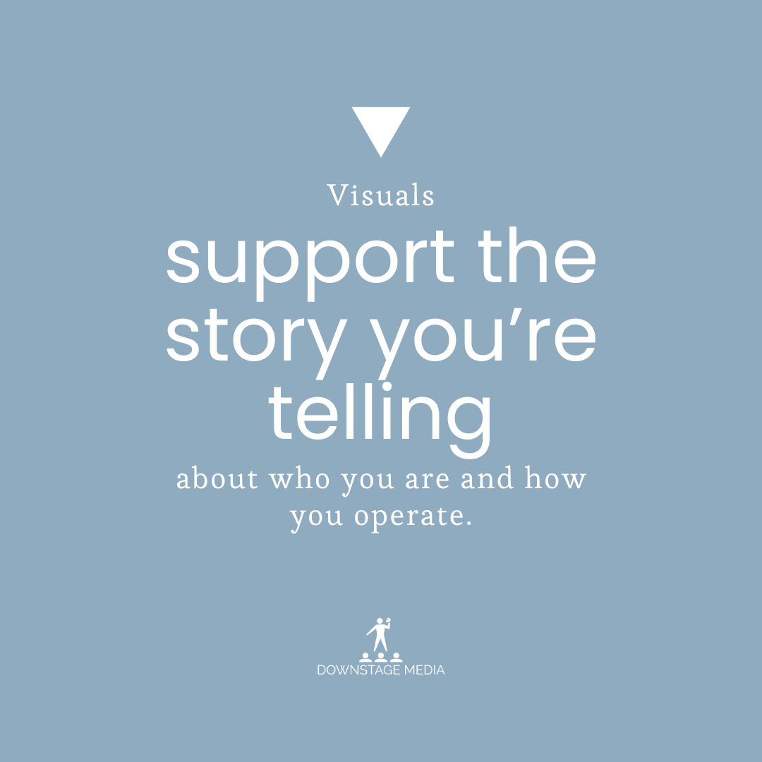
Your visual identity should reinforce your positioning. Every design choice supports the story you’re telling about who you are and how you operate.
He kept coming back to alignment. The visuals should support the story you’re telling about who you are and how you operate.
That means the story comes first.
What do you want to be known for?
What do you want someone to understand within seconds of landing on your site?
What room are you stepping into?
When those answers are clear, it helps shape your design. Your layout highlights your message. Your imagery reflects your audience. It all connects.
The result feels cohesive because it grows out of strategy instead of being shoehorned in.
Refine the Message That Supports Your Brand
If your visual identity feels inconsistent, or if you’re not sure whether it reflects the level you’re stepping into, it helps to step back and look at it strategically.
On a strategy call, we’ll review your positioning, the rooms you’re trying to enter, and the touchpoints where your brand shows up. Then we’ll identify what’s aligned, what’s drifting, and what needs to be tightened.
If you want your visual identity to support your authority instead of raising quiet questions, schedule a call and we’ll map the next step.


Annie Figenshu is keenly aware that many companies are pressed for time, and every minute counts. She helps brands make the most of their content marketing so that their hard work is shared with the world. Annie is certified in both StoryBrand and Mailchimp, has two kids with Beatles-themed names, and is afraid to think what a day without coffee would look like.